

National income is climbing, but the share going to wages is shrinking: 6 graphs that explain the economy
- Written by John Hawkins, Senior Lecturer, Canberra School of Politics, Economics and Society and NATSEM, University of Canberra
Australia’s economy edged closer back towards normal in the three months to March, growing by 0.8% in the quarter (which is towards the upper end of economic growth before COVID hit in early 2020) and 3.3% over the year to the March (which is somewhat higher than before the pandemic).
The economy is now 4.5% bigger than before the COVID pandemic started. This is a stronger recovery than experienced in the United States, the European Union, the United Kingdom, South Korea and Canada.
Japan’s economy remains smaller than it was before COVID.
Consumer spending grew an impressive 1.5% in the March quarter, and 4% over the year, spurred by a further easing of restrictions and a renewed desire to travel.
Spending on travel services surged 60%. Car sales jumped 13%.
Helping fund the increased spending was a further dip in the household saving ratio, slipping from 13.4% to 11.4% of income.
As seen on the graph, it is still much higher than it was in the four decades before COVID, giving it room to fall further if consumers remain confident.
The drop in unemployment to a half-century low of 3.9% has lifted consumer confidence and spending, although the jump in inflation to 5.1% and the first of several interest rate hikes have damped confidence more recently.
Government spending, notably on health care, contributed to economic growth.
Read more: Inflation hits 5.1%. How long until mortgage rates climb?
The Bureau of Statistics noted a surge in imported rapid antigen tests.
Construction was weak, both for business and housing, partly reflecting shortages of skilled labour.
The closest measure of total average well-being we can get from the national accounts is real net national disposable income per capita.
While this climbed 1% in the March quarter, it doesn’t necessarily mean the typical Australian household is better off.
What matters is how the cake is divided between wages and profits.
The Russian attack on Ukraine drove up commodity prices, driving the ratio of export prices to import prices to a record high.
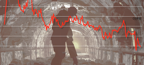
This lifted the profits of Australian mining companies 25%.
The share of national income going to profits climbed to an all-time high of 31.1%.
As a result, even though more of the population was in work than ever before, the share of national income going to wages sunk to a near all-time low of 49.8%.
Before COVID the wages share was 53%. At the start of the 2000s it was 56%.
Working out the reasons for the downward trend in the share of national income going to wages, and how to get it higher, will be an important priority for the new government.
Read more: At 3.9%, Australia's unemployment rate now officially begins with '3'